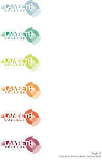

Here's are 2 logo ideas we came up with. I added the colours we chose. Logo 1 has transparent graphic element, so the background colour should be decided in the brand book.
As you can see, logo 2 have different colour versions. In terms of readability, I thought it would be nice to have different colour versions so that there will be some choices when it comes to placing the logo on to the colour background.
What do you think?


